


By Keegan Ohta
Look at any of the teams in professional sports and tell me which ones have a cool looking logo. Do the Pittsburgh Pirates instill fear? Or does the Cardinal from Arizona look fierce?
What some people don’t realize is that the best logos come from the minor leagues of baseball in America.
Back when I was younger playing baseball, I would have loved to have an original and sharp looking logo, instead of the Cal State Fullerton Titan or the Florida Gator because it’s not original.
But the logos of these teams are exactly what put a smile on my face and hopefully it will for you as well.
Here are my Top 10 picks of minor league logos:
10. Rocky Mountain Vibe
![]() So I guess the name Utah Jazz was already taken, so this team probably had to switch up the team name. But it’s a good thing that the logo is what takes this spot. How many people would use a s’more as a mascot? The fact that this S’more is still on fire and is wearing glasses and sneakers makes this one of the “coolest” looking mascots I’ve ever seen.
So I guess the name Utah Jazz was already taken, so this team probably had to switch up the team name. But it’s a good thing that the logo is what takes this spot. How many people would use a s’more as a mascot? The fact that this S’more is still on fire and is wearing glasses and sneakers makes this one of the “coolest” looking mascots I’ve ever seen.
9. Akron Rubber Ducks
![]()
 Let me be honest and say that I can only remember ever taking a bath with a rubber duck maybe once or twice in my life. But had this been the rubber duck in my bath, I probably would have cried “fowl.” Anyway, this mascot takes a child’s bath toy and makes it look fierce. Akron is known for their history of rubber and the birthplace of some famous tire companies, so they pick the rubber duck and make it look awesome and fierce. Maybe even giving Oregon a run for their money…
8. Trenton Thunder
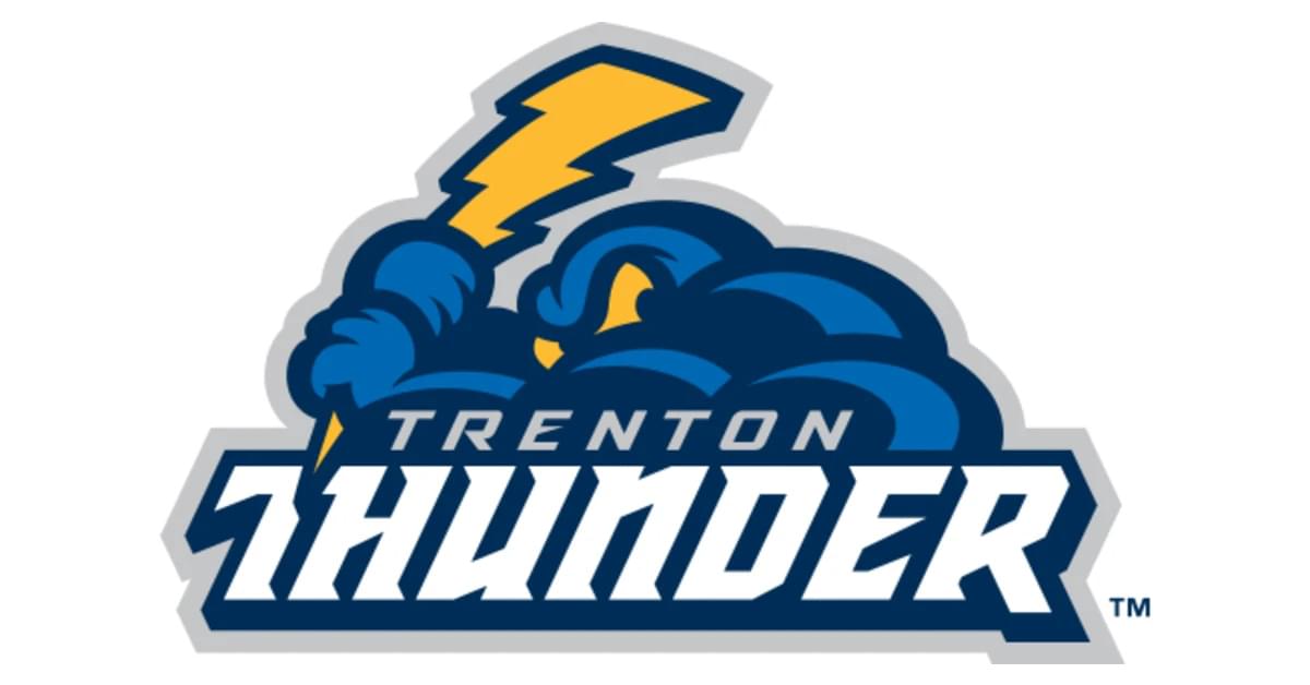 AC/DC music please!…Oh wait I’m writing this not talking about it…shucks. The Trenton Thunder have one of the coolest looking logos because this cloud wants to rain in on any pitcher’s parade. The lightning bolt that acts as a bat will do one of two things to the ball: fry it or send it (obviously you want the second option, I think the frying it is considered an out?)
7. Modesto Nuts
 You’re probably going to ask, “wait, am I reading this correctly?” And my response would be yes, a nut has made it to the top 10 on my list. Seriously, you look at that thing and tell me it doesn’t creep you out. Imagine that you’re about to eat that and it gives you that face. Would you still eat it? I for sure wouldn’t, but that’s what makes it a great logo.
6. Omaha Storm Chasers
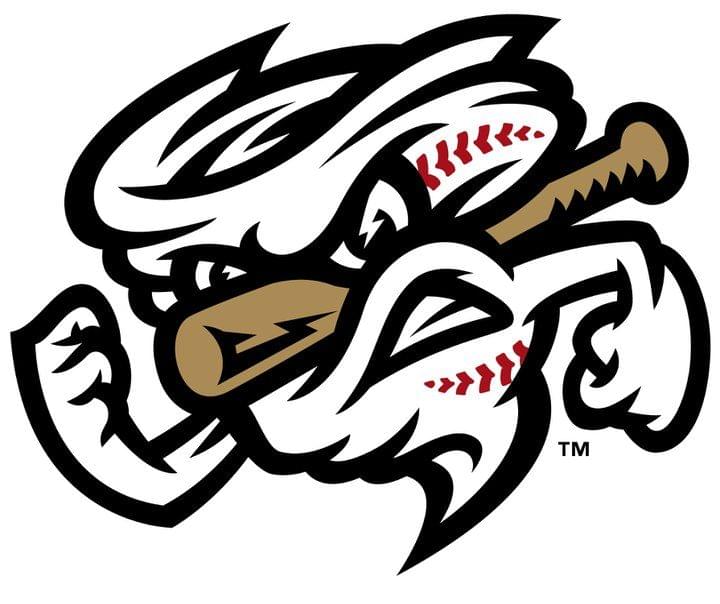 Omaha, the middle of tornado country, made a logo that looks like a tornado, has a bat sticking through it, and has baseball seams on the side of it. It’s awesome. Even the nickname gives this logo more quality to it. Let’s be real here folks, if you’re storm chasing and you see this thing appear, run. Run away as fast you possibly can.
5. Aberdeen Iron Birds
 Look straight at that logo and tell me that doesn’t scream awesome. That bird is starting right at your soul and even the other parts of the logo are awesome. Rocket powered wings, iron talons, a golden beak. I really don’t know how this logo doesn’t make more top 10 minor league logo lists. Even the name sounds awesome, like a jet.
4. Lehigh Valley Iron Pigs
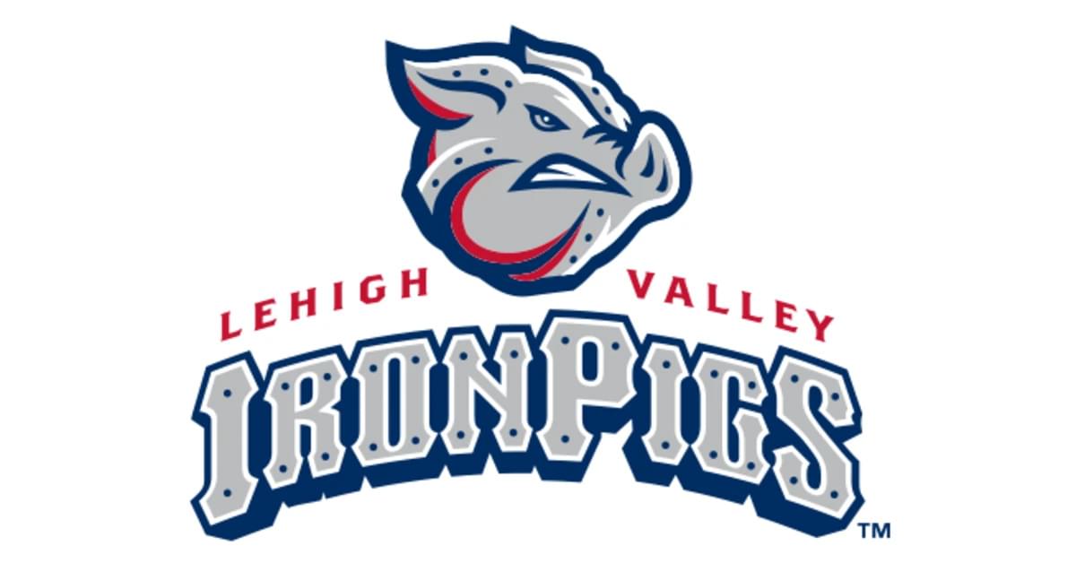 So Chris Hart mentioned this one on the Sports Animals and I had to look this up to make sure I wasn’t hearing things wrong. But I’m looking at this logo now and let me tell you I would put this logo up in my room in an instant next to the Iron Bird of Aberdeen. You can obviously see the pig, but the screws on the logo itself just makes this logo that much more intense than just the name Iron Pigs.
3. Erie Seawolves
 This logo is just flat out nice. This nice looking wolf brings out the best in a logo, staring you down with an intense one-eyed stare and a patch to cover the other before you get too mesmerized. Then there’s the attention to detail, notice that the sabers are bats instead of sharp metal and the that entire logo itself looks like a baseball field. Trust me when I say this logo has got…it.
2. Richmond Flying Squirrels

This team used to be called the Connecticut Defenders, but when they relocated to Virginia, they had a name the team contest and landed up with Flying Squirrels – and let’s face it, this mascot is way better. The logo was named logo of the year by Ballpark Digest in 2010 and was the best Minor League logo in 2015 by Baseball America. It’s a flying squirrel…and yet it just looks awesome. It looks like a superhero from a comic, but it’s a flying squirrel.
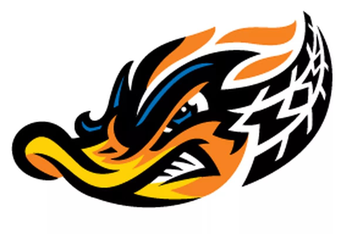
1. Florida Fire Frogs
 I know most websites you see out there won’t name this as their top pick for a logo, but come on. This logo is fire, and that pun is totally intentional. A frog that’s red and on fire doesn’t exactly sound pleasant, but you look at this and it looks awesome. The fact that their nickname is Fire Frogs and they have this awesome looking logo is the exact reason why it’s number one.